Digital Imaging
Assignment 2015
What This Blog Is
About
I am writing this blog as part of my assignment for the
digital imaging module I am currently studying at university.
For the assignment I have been asked to create a DVD
amaray case cover for either a film or video game of my choosing, it can either
be of my own creation or for something that already exists. I also need to
produce a DVD label that could be applied to the disc itself, and a one minute
promotional video to accompany my game / film.
In order to create these pieces of work I will be
using Adobe Photoshop, for the amaray cover, illustrator for the disc
label and Premiere to create the video. Over the course of the 12 week semester
I will be using what I have learnt in lectures and also what I have
researched on my own to create the finished articles.
The aim of the
assignment is to be able to, at minimum, demonstrate the following techniques:
Photoshop
- Set up file with correct size, dpi and colour.
- Use of appropriate selection tools.
- Use of filters.
- Use of layers.
- Layer transparency.
- Use of levels
- Use of guides
Illustrator:
- Use of the pen tool.
- Use of the type tool.
- Placing of images.
- Use of brushes.
- Use of clipping masks.
- Use of guides.
- Use of layers.
- Transparencies.
- Text wrap.
- Set up the file correctly with appropriate frame rate and size.
- Importing images, audio and video.
- Trimming of clips.
- Adding transitions and effects to clips.
- Adding titles over clips.
At the end of the project I will submit a final render of my
amaray case cover and disc label and a fully edited video and this blog will
serve as a logbook to accompany that.
Ideas for a Theme
The first step was to decide whether I would base my project
on a game or a film. This was quite an easy decision for me as I am a keen
gamer and play a lot of Xbox in my spare time so the logical choice was to go
down the video game route.
Although deciding to
do a video game was an easy choice picking what type of game to cover proved
difficult. There are many genres to choose from: racing, RPG, sports, fps etc.
My initial thoughts were to either do an fps, as I play a
lot of this genre, plus there are plenty of games that have been produced in
this arena which meant I would have a lot of previously made footage to play
around with. I felt the same with the sports genre as again many games have
been made plus, with regards to the video, there would be plenty of stock
footage I could use.
I felt that it would
be too easy to just reinvent something that had previously been released like
Call of Duty or even the FIFA series of football games. So for the purpose of
originality I thought I would try and create something original that hadn’t
been done before. This in itself was quite a challenge because as with films,
originality in games is hard to come by as many things have already been done.
I decided to go with
the sports genre of gaming, but I felt to try and create something different I
would need to use a sport that was less well documented than something like
football. I also felt that if it was “gimmicky” then this would give it the
extra “je ne sais quoi” it needed to stand out and be totally different from
other games.
So having scoured
the internet for sports games that I managed to narrow down the choice of
sports that had few or no computer games: snooker, darts, lawn bowls and
squash. At this point I want to add that I wanted to keep the project light
hearted as I personally don’t feel as a gamer that I would be able to take a
squash or lawn bowls game seriously.
With this in mind I
decided to go with lawn bowls, as it feels very far removed from the teenage
target market that most games are made for. And to give it that extra gimmick,
to make it totally unique, I decided it would be in space thus creating the
idea of Space Bowls.
So now I have my
idea I can get started with designing and creating my amaray cover for the
game’s case.


Amaray Design
For the design of the amaray cover I took to the internet to
research how other game covers looked and to get a gist of layout. Below are
some images of some of the things I looked at.
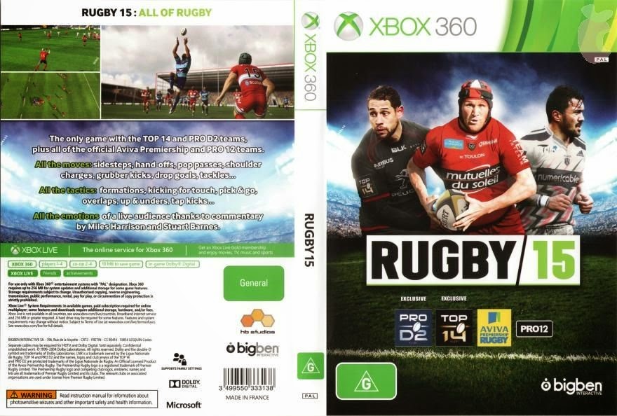
These 3 covers suited my idea as they are all for sports
games and they give a good idea of the sort of layout I would need to use for
my case cover.
Next I found the following template for an Xbox game cover
which would provide me with all the official logos I would need.
As you can see it has all the relevant branding I need and
also the safety information on the back. It also gives me an idea of the space
I have to work in.
To make sure I was working accurately and to the correct
size I found the following template for the measurements of the case cover. I
found this, like with the other images, on google image search.
As you can see there is a 3mm bleed. This is to accommodate
the printing process where ink may bleed out over the border of the image. It
will allow for a clean edge once the image is cut out.
Now that I have an idea of content, layout and size of the
image I drew out a rough plan of how I wanted my cover to look.
At this point I had already decided I would call the game:
Space Bowls 4k56!
Now I moved on to the creation of the amaray cover.
Creating the
Amaray Cover
So for this part of the assignment I used Adobe Photoshop to
create the final image. I will now talk you through the step by step process I
went through to get to the final render.
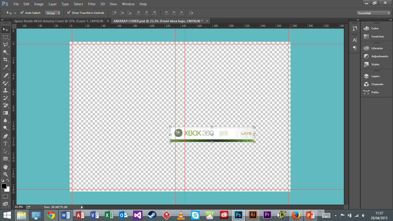
First of all I needed to set up the file correctly so it was
the correct size, shape, resolution and colour scheme ready for printing at the
end.

I set the measurement to millimetres in order to get the
correct sizing. I also changed the colour mode to CMYK from RGB. This is
because RGB is used for graphics and CMYK for printing. I set the resolution to
300 as the standard printing resolution is 300 dpi. I also kept the background
transparent to make it easier to see my work when I began. This created the
correct sized canvas for me to work to.
The next step was to measure out some guide lines to create
outlines for the front cover, back cover, case spine and also the bleeding
edge. I did this by selecting view then new guide. This allowed me to manually
add the guide lines by typing the exact measurements I wanted. I had to repeat
this process for each line until I had the following result.

Now I have my guides in place I could start adding some
imagery to the canvas. I started by adding the front xbox logo.
I did this by loading the image of an xbox 360 game cover
template. I then used the rectangular marquee tool to outline the logo I
wanted. I then dragged and dropped, what I had cut out, into my blank canvas.
I then used the move tool to position the image correctly.
It was also too small so to resize it I expanded the image again using the move
tool, whilst holding shift + alt, and dragged out from the corner until it was
the correct size and fit along the top of the canvas.

I repeated this process for the logo on the spine.
The next step was to start creating the artwork on the front
of the case. I found a stock image someone playing bowls.

I needed to edit the original image as I needed to get rid
of the sky and keep the grass and also the central figure who is in the process
of bowling a bowl. I also needed to get rid of the people in the background along
with the trees and fence. I opened this image in photoshop.
I used the magic wand tool in order to create a selection
around the man bowling and the grass. I altered the tolerance at several points
in order to get the selection I wanted. I then used the polygonal marquee tool
in order to get the edges correct along the bottom of the grass and tidy up
other edges. Once I had my selection correct I went into the layer options,
layer mask and clicked reveal selection. This then got rid of what I had not selected
without destroying the original image. Then I needed to get rid of the feet and
rake from the people in the background. In order to do this I used the clone
stamp tool. By selecting a patch of grass I covered over the areas that needed
attention. This then left me with the following image.

I then dragged and dropped it onto my main canvas and
re-sized it to fit whilst holding shift + alt.

The image’s ratio looks a bit out but I think it still looks
acceptable.
Now I needed to add the space element into the background.
So I once again went back to google images to get a stock image of space.

I loaded this image in Photoshop and placed it onto my main
image. I then resized it to fit whilst holding shift and alt.

These two images now formed the base of the cover, however
they did not sit well together with a hard edge between them so to remedy this
I added a picture of a picket fence into the background to help bring the
images together, plus I thought it would be in keeping with the bowls element.
So I found a stock image of a picket fence from
the internet.

Then, once loaded into Photoshop, I proceeded to use the
magic wand tool to create a selection area around the fence itself. This was a
quick and easy way to select a large area although due to the tolerance level I
found that some of the sky in between the fence posts had also been selected.
So to remove the bits I did not want I used the polygonal marquee tool to
remove from selection the bits I did not want and neaten up the edges.
Once the selection was complete I used reveal selection in
layer mask to achieve the following result.

I then dragged this onto the main image and resized to fit
accordingly.

I also had to place the layer, the fence was on, in between
the bowls player and the picture of space to achieve the correct effect.
Next I wanted to add in the title for the game: Space Bowls
4k56! I did this by selecting the horizontal type tool and clicking the area I
wanted the title(Just above the bowls player’s head).
I then played around with different fonts until I found one
that I felt suited the cover.

I wanted to keep the colour of the font however it was not
very visible, also the text looked plain so to jazz it up I added an effect to
the text. So by double clicking the text layer it brought up the layer effects
panel and I added an outer glow effect which made the text stand out and
generally its appearance was improved.

I felt the image was looking good but a little sparse so I
decided to add a couple more elements into the background. I thought I would
add in a planet and a spaceship.
I started with a picture of Saturn I found on google images.

Once loaded into photoshop I used the magic wand tool to
create a selection of the planet and its rings. I decided to leave the gaps in the
rings out of my selection so that when it was placed over the space background,
on the main image, you could see through them.
Once the selection was made I used reveal selection in layer mask to get the following outcome.

I then dragged and dropped this onto my main image and
resized to fit. I also rotated the image from the corners of the transform
controls around the image.

Next I added the image of the spaceship so I found a picture
of a tie fighter on google images.

Then using the same technique as before I selected the image
and created a layer mask before placing it onto the main image and resizing it.

I still felt the background was a little sparse so I added a
picture of Neptune using the same technique as before.

I felt that the images in the background were a bit dull
compared to the man playing bowls, as that image was bright and colourful.
To remedy this I applied an adjustment layer over the top of
the planets, space and the tie fighter. I adjusted the brightness, colour
saturation and also gave it more of a blue hue which achieved the following
result.

That was pretty much the complete image for the front cover,
all I needed to do next was add in the usual age rating information and also a
logo for a fictional game studio that I had created in adobe illustrator.
First I found a pegi 18 logo from the internet and
downloaded it as an svg file, in order to get a good quality image. I then
loaded it in photoshop and selected it with the rectangular marquee tool and
then placed it onto the main image, and resized whilst holding shift and alt.

Next I added the game studio logo. I created this logo in
illustrator for the purpose of putting it on the disc and the amaray cover. I
go over how I created it later when I am writing about my disc label.
I had to export the file from illustrator and save it as a
jpeg in order to open it in photoshop with good quality.

Once I had done this I used the magic wand tool to select
the image and create a layer mask. I then dropped it onto the main image and
resized it.

This was the final stage in completing the front of the case
cover so now I moved on to complete the back and spine.
I started with another image of space to act as the main
background on the back and spine, so I found one very similar to the one on the
front.

I rotated the image then loaded it into Photoshop before
placing it onto the main image and resizing to fit. At this point I had to move
the layer on the spine with the Xbox logo over the top of the image of space.
I also moved the layer with space on beneath the adjustment
layer, with the changes to hue and contrast, so it married up with the front
cover.

Next I added the title to the spine of the cover. I did this
by selecting the vertical text tool, typing the text then changing the font and
also adding the outer glow effect to match the title on the front.

All xbox games have standard game and console information
printed at the bottom on the back cover.

So I loaded the xbox template I had into photoshop. I then
used the rectangular marquee tool to select the part of the image I wanted and
then dragged and dropped it into my main image. I then resized to fit.

Next I added a couple of screenshots for the game. Now there
was next to nothing I could use as game images in the first instance which is
why I decided my game would be and fps/ lawn bowls game. So I found an image of
a sci-fi style shoot em up to use and another image taken from a screenshot of
a game called star citizen. I loaded them both into Photoshop and then placed
them onto the main image and resized.

Having looked at other game cases I decided I needed to have
a tag line to go with the game, and to stay in line with the light hearted
nature of it I went with: “Prepare to suck some bowls!”. I added this to the
main image using the horizontal text tool, setting the colour to white and the
font to Microsoft Tai Le Bold.
In order to fill in some of the space on the back I decided
to add another spaceship. So I found another picture of a tie fighter on the
internet and loaded it into Photoshop. I used the polygonal marquee tool to
make a selection around the image and then created a layer mask. I then dropped
it into the main image and resized it. I then moved it so it was underneath the
layer with the Xbox info on it so that the images married up nicely.

All I had left to do was write a short blurb about the game
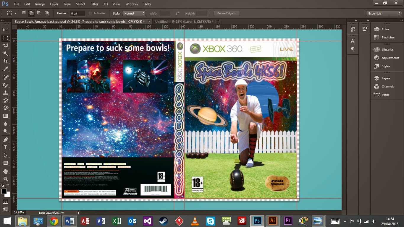
and I was done. Here is the final render of the amaray cover.

No comments:
Post a Comment